i think this is the first time i drew her, this was in november 2020. i also drew the different inventions she uses for her spells, some of which i still like and some i think are kinda stupid (looking at you arcane lock). the actual drawing of rosalyn is bad and uninteresting so please dont look at it.
designs still too boring for me, though now she has a messed up finger from casting a powerful spell from this weird old staff. i made her that cardigan to try to imitate the sillhouette of a lab coat in a time period where they probably dont exist yet, and her clothes are blue because that color represents calmness, stability, and widom. i thought that was funny because rosalyn is neither stable nor wise, but she cares enough about science to at least dress the part. her hair's a warmer color to start to show how fired up she actually is. this was april 2021 so 5 months after that first drawing, so i had gotten a decent enough understanding of what she was like as a character and what her story was by then. i like this one enough in concept but i dislike lots of other things about it and also the wings are at the wrong angle so please dont look at it.
i. really dont like this one. please please please dont look at it. since rosalyn exists in dnd fantasy setting i wanted to do a modern version. i think the only part i enjoy is her phone lock screen but pretty much everything else is bad. please dont look at it
i wanted her design to have more to it so i gave her goggles and a scarf (ive always thought of the scarf as being her moms and the goggles her dads, but i dont think ive ever brought that up in a session whoops). also lots of straps and pouches and stuff that do not last long because they were kind of a pain to draw all of them and/or i just forgot. the goggle lenses are red in another attempt to indicate fierce passion and energy inside her, and her gloves and bag add more of that brown from her hair to more areas. the fingers shattering is a representation of what was happening in the campaign, and the leg looking weird is just because of not being great at anatomy. i only like maybe 1/8th of this one now so please don't look at the rest of it.
i started getting really into pokemon at this point (my first/favorite is pokemon black/white) so i tried drawing her in that art style, along with pokemon she'd have (mechanical ones, since shes. a mechanic). the pokemon are positioned a little boringly and her staff looks completely flat but besides that i actually still like this one. you can look at this one if you want.
this is the first one where i actually tried to do a background, which i dont do often (if that wasnt already clear). the robot is malcolm, her mom's steel defender who has a brother/sister relation to rosalyn. i ended up changing his design later to get rid of all those bolts so hes easier to draw and also give him some more range of movement for his limbs, because as of this drawing hes too stiff. rosalyn's actually the one part of this drawing that i dont like that much (im just now realizing i forgot her gloves). you can look at this one, just dont linger on her too much or ill get embarrassed and ask you to stop.
i got really into neon genesis evangelion at some point and found some parallels rosalyn had with some characters in it (abandonment issues, intense loneliness and ennui at a young age, has a robot who she sees a part of her mom in) so i tried to draw her in the nge style. rosalyns okay i think -shit i forgot her scarf- but i do like eva malcolm. i carried over some things like his 3 eyes, the dots/speaker mouth, and the tubes, and that spikey pattern on his shoulder thing and going around his arm was meant to be the same as the end of her staff in the campaign.
this was january 2022. she went through a major incident and turning point for her in the campaign at this point, so i figured it was time for a redesign. she went through an explosion caused by breaking her staff over her knee, so i put in scars that would be around the center of the blast. a bunch of her clothes also got ripped up by it, and she lost 3 fingers so they got replaced by prosthetics. soon shell have a gem stuck in her head, but i made this design a bit prematurely so i didnt know that yet. also, she cut her hair and that hairstyle hasn't really gone away since. maybe next time
i got really into hades so i tried to draw her in the art style, you know the drill by now. you can see a tiny bit of that forehead gem that shouldve been in the last one under her hair. since shes a mechanic inventor character, i figured shed use the daedalus hammers that are in the game. unfortunately i made the pose really boring and theres lots of things that just feel off when i look at it. maybe ill try again in the future but please dont look at this one.
she got a new hammer and a bag made of skin that i wanted to draw. theres still a lot about this that i like but the anatomy doesnt look right and i think the hammer head could've had a more interesting shape than essentially just a box.
she got one of those plague doctor masks at some point. i still like this one, but it does bug me that her shorts are different from that design i drew earlier. forgetting parts of character designs when i draw them happens frequently for me, and i usually don't notice until after i've already shown it to people. if i do notice at all
another try at the modern version thing. i gave her a similar jacket to one i have in real life so i could use it as easy reference. her forehead gem got repurposed to just be a thing hanging from a necklace. also side note i can never decide how to draw ears ive already gone through several different ways just in the images ive shown. and they keep being too small
ah great, we're back to one that i just dislike looking at. i wanted to do a coffeeshop au one but this execution is not very good. all the shading i tried to do just kind of looks like shes been smudged with soot, and the anatomy is thoroughly dubious. don't look at this one.
this was when i had the sudden realization that as someone with access to drawing materials, i had the power to make any of my characters wear anything. and so this exists.
i finished the sketch and then couldnt decide how i wanted to render it, so theres two of them. i still dont know which one i prefer im very indecisive
this time it was hunter x hunter that ensnared me in its grasp. i really enjoy thinking about her in different scenarios and settings in case that wasnt already obvious. she'd be a conjurer, by the way. (i do have a specific nen ability she'd have typed up in my notes app but it is way too long and complicated to put here)
june 2022, which is only 5 months after the last redesign. in retrospect thats a really short time in between designs, but to be fair she had another big thing in her life happen and got a new weapon. its this ancient rune-covered elven spear that has a lot to do with stars and nighttime, so i put in some of those twinkly star and crescent moon motifs. plus, having those crescent moon shapes mirror eachother makes them look like the whites of an eye, with the space in between as the pupil. i also had her put her cardigan back on because i missed her having a lab coat-type thing. for her bag strap, i thought it'd be funny if i had her carry around a bunch of chemicals like a bandolier. i changed her scars a bit, the one on her leg i tried to make look a bit more like an eye (lots of eyes! maybe someone out there's watching her)
i dont have much to say about these. theres an eye over the gem in her forehead because vecna (old powerful death magic guy) uses it to see what she's doing.
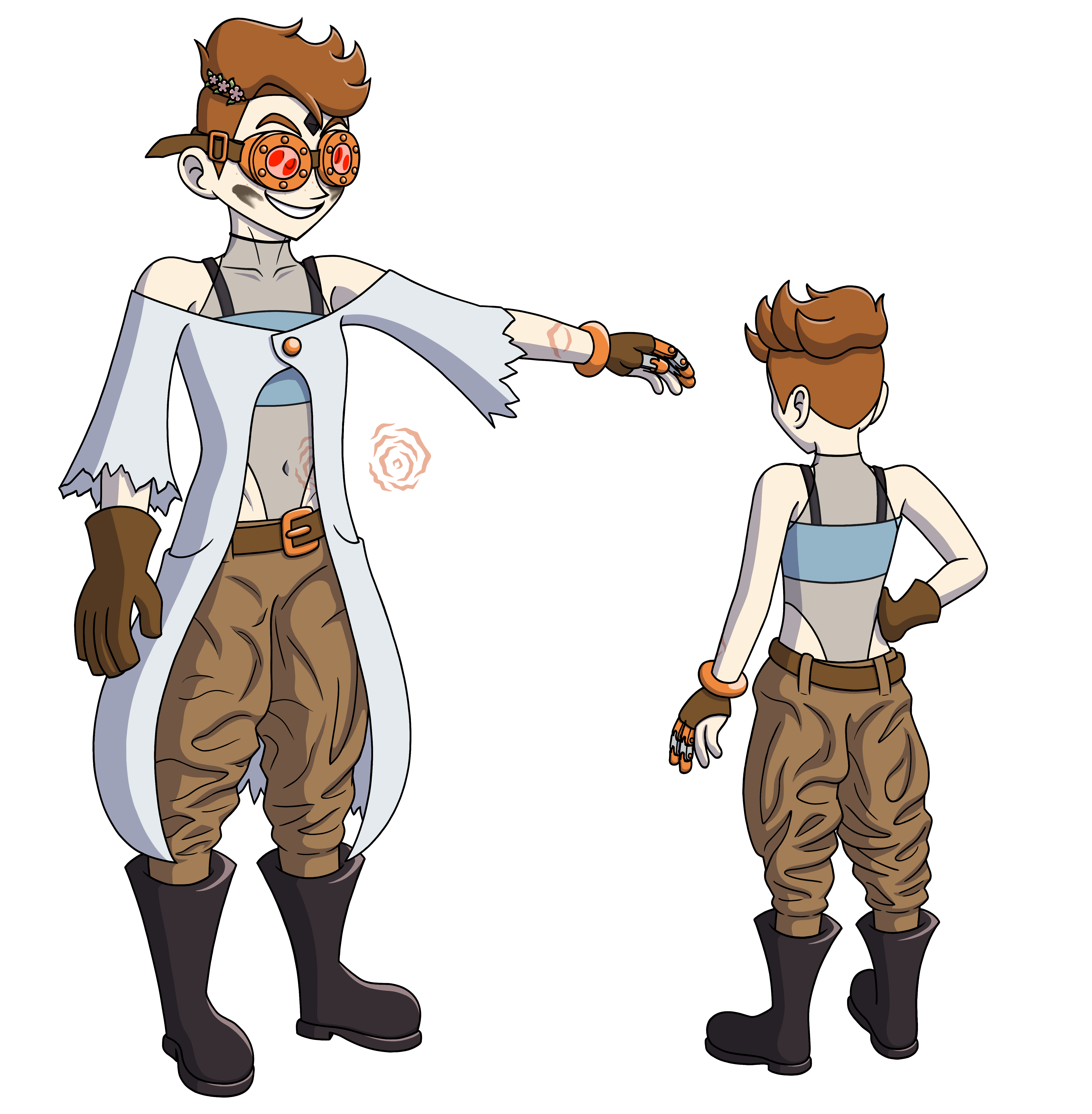
february 2023! 8 months since the last one. that might seem like a long time given that i only made one finished drawing of her since the last redesign, but that was mostly because i was busy with school. having 4 designs over about 2 years is probably a bit excessive, but i wasnt happy with where it was. gone with the jorts, now she has baggier work pants. as shes gotten to know people and make friends, that warm brown has grown to take up half of her whole body. her belt is loose and her pants are sagging because 1) it emphasizes the fact that shes malnourished and 2) it reflects how inept she is with rules of society, she knows the fact that people wear belts so she puts it on but she doesn't really understand why or what the point is, so it ends up off kilter and ineffectual. her boots are now more of a waterproof rubber kind, and their increase in size as well as being the same color as the gem in her head is meant to show a growing influence from vecna. her shoulder straps are also that same black color, showing how its wrapped around her. since the scars on her leg arent really visible anymore, i changed the one on her arm to try to keep that eye shape. the flower pin in her hair was given to her by aeschylus, a different player character in the adventuring party.
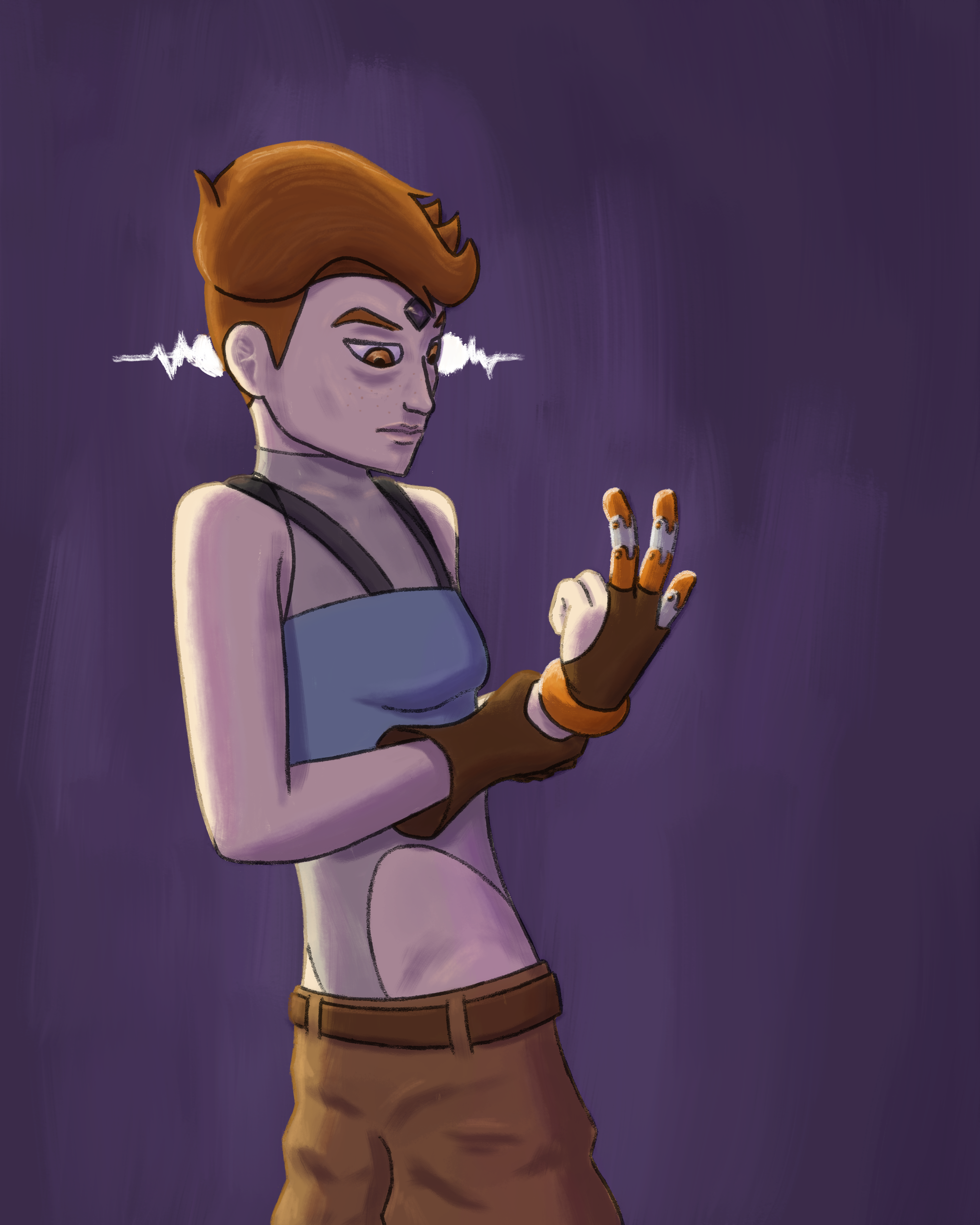
i just wanted to try drawing her with her new design to see how it felt. she hadn't shown much reflection about the events that led to her losing her fingers, so i wanted to draw her actually thinking about them.
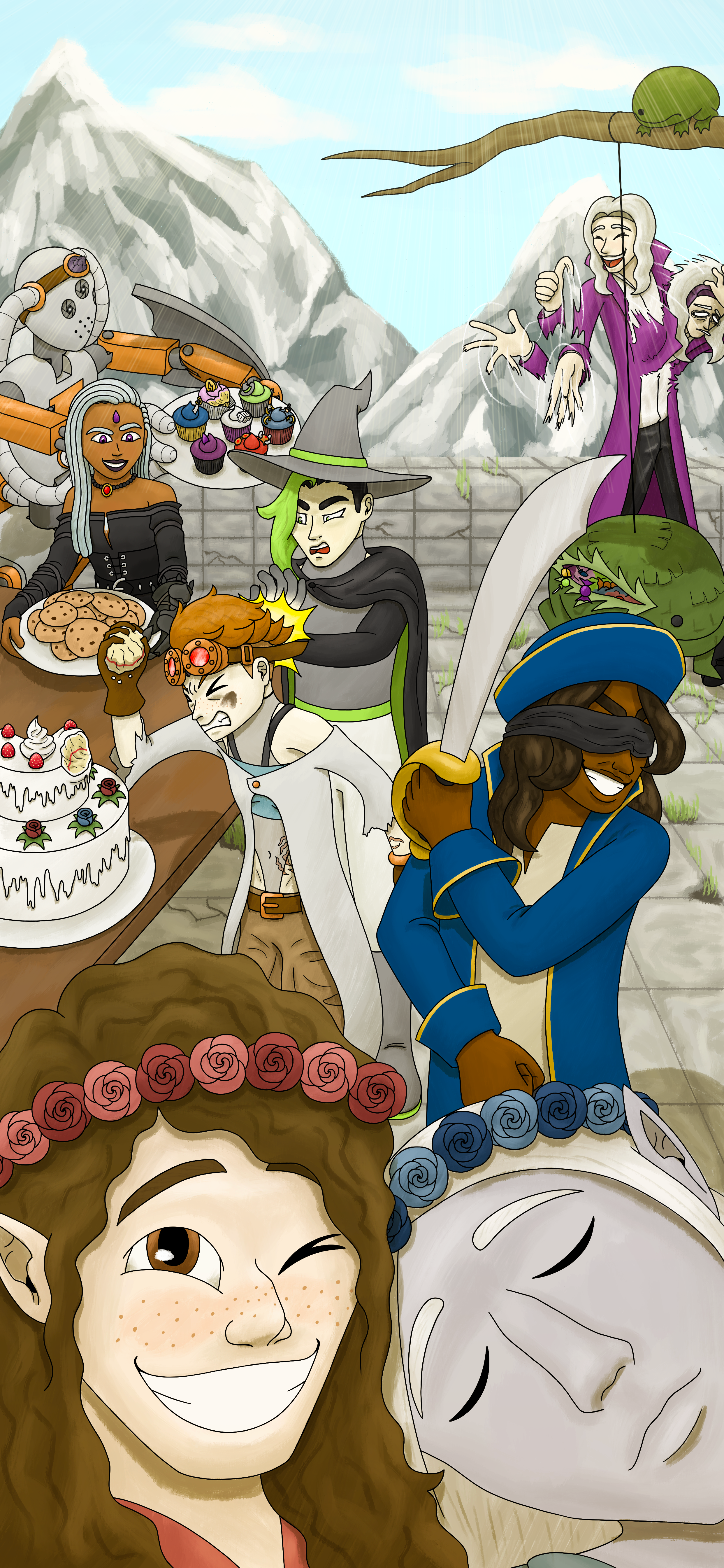
i wanted to change my phone background to something that rosalyn would actually set as her own in-character, so i drew a selfie taken at the wedding of two of the other party members, aeschylus and valrysian (ace and val for short) (i dont think the technology for picture-taking exists yet in this setting but uh. shhhh its magic). malcolm's got some design changes, rosalyn made him a headband of intellect which makes him smarter so now he's got some glow to his eyes, and a gem in his forehead to match with rosalyn's. he also has a hand on his left arm now, since at the start rosalyn wasn't skilled enough to give him such fine motor movement but she has since been forced to get better at mechanical hands. also his joints and hinges and such have been altered to let them move and twist around better. the cupcakes he's holding each correspond to a different character of ours, including the one i had before rosalyn who died, which is why there's bites taken out of his already. even though i still use it as my phone wallpaper, i kind of dont like it that much anymore ? i should make a new one.
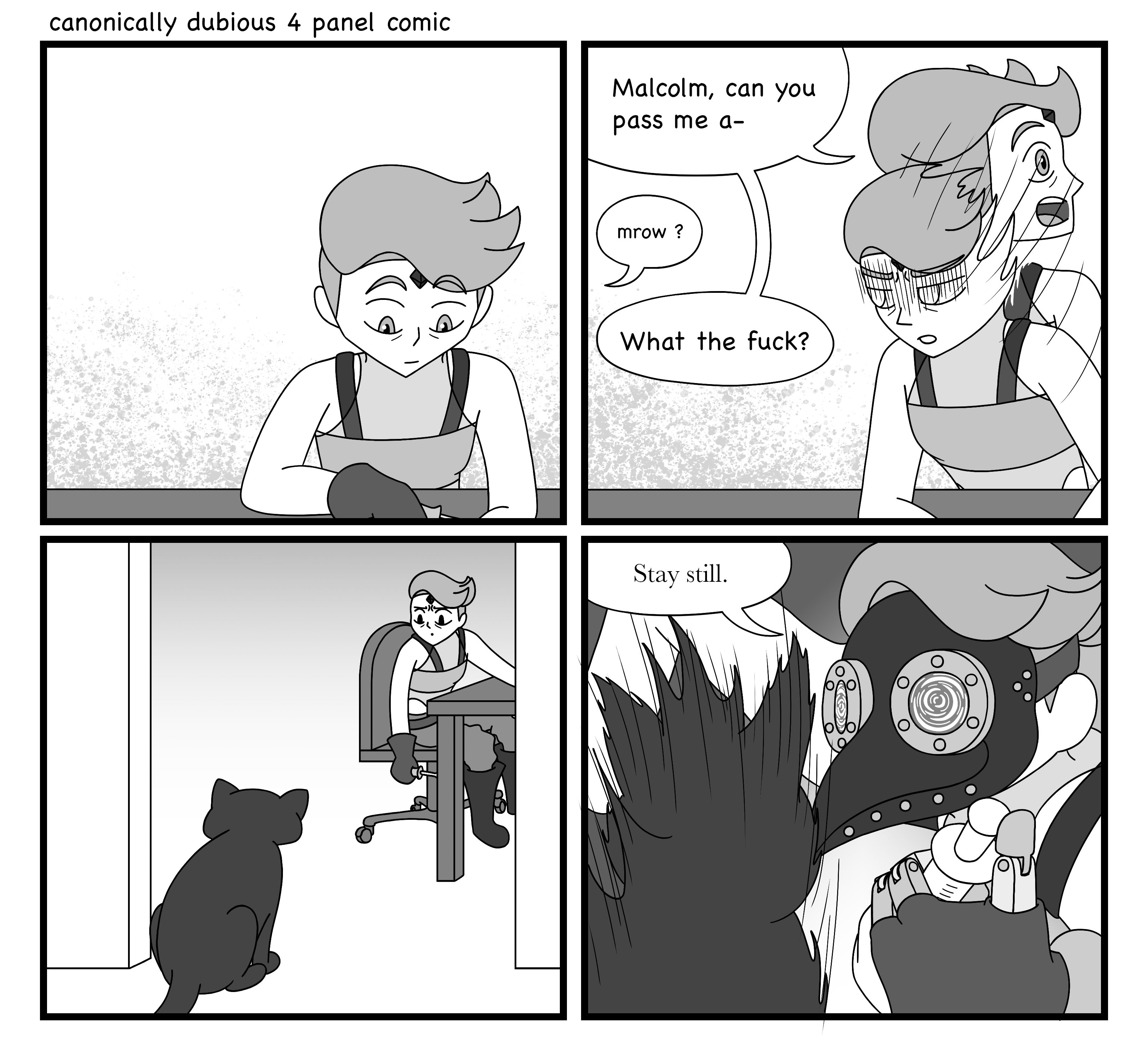
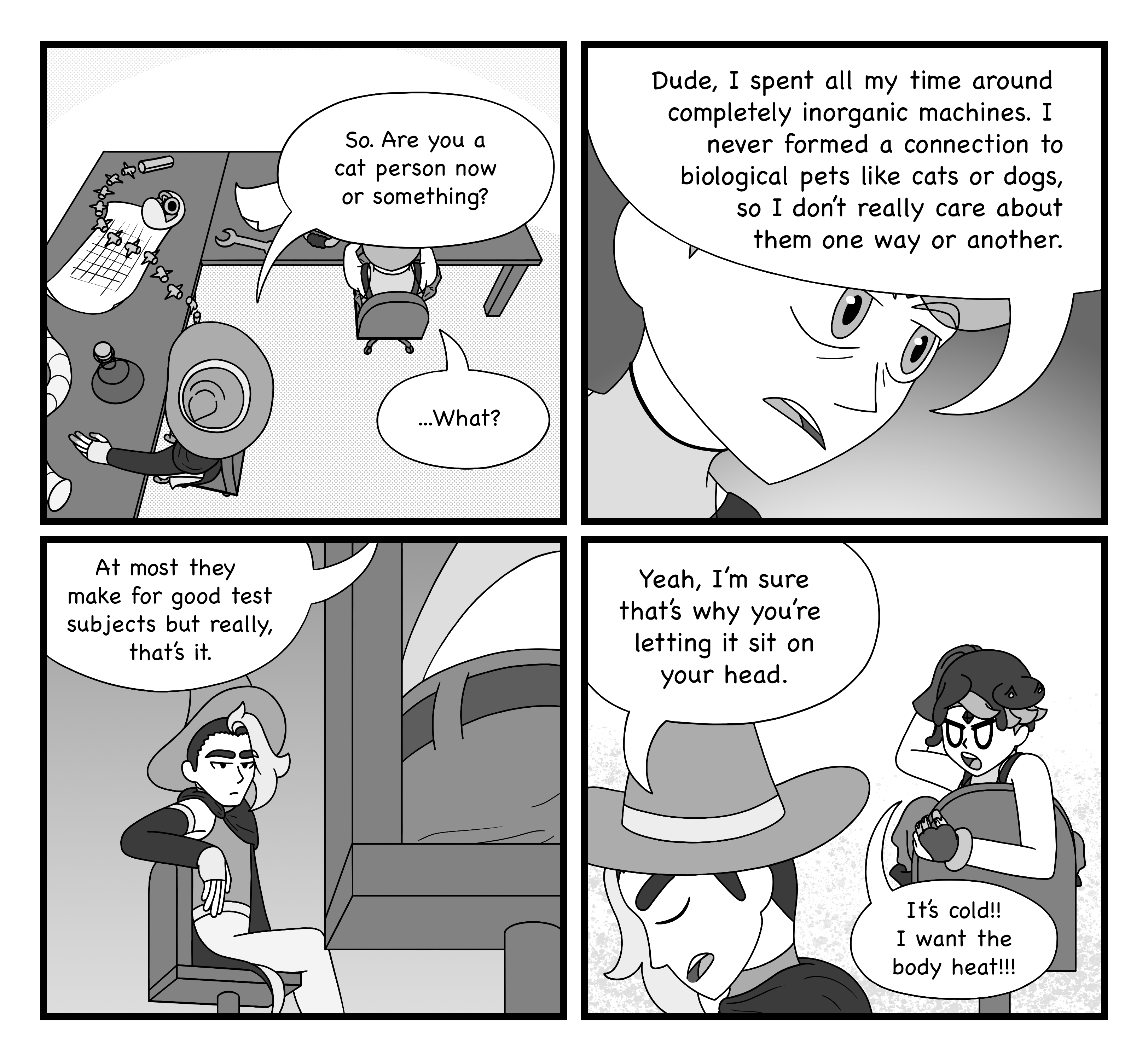
i started wanting to make more comics, so i did these 4 panel ones where she makes friends with a cat and talks to kuro, another player character. in retrospect, i dont really like the art i did for these that much.... but i do like the idea that she made wheelie chairs for her lab.
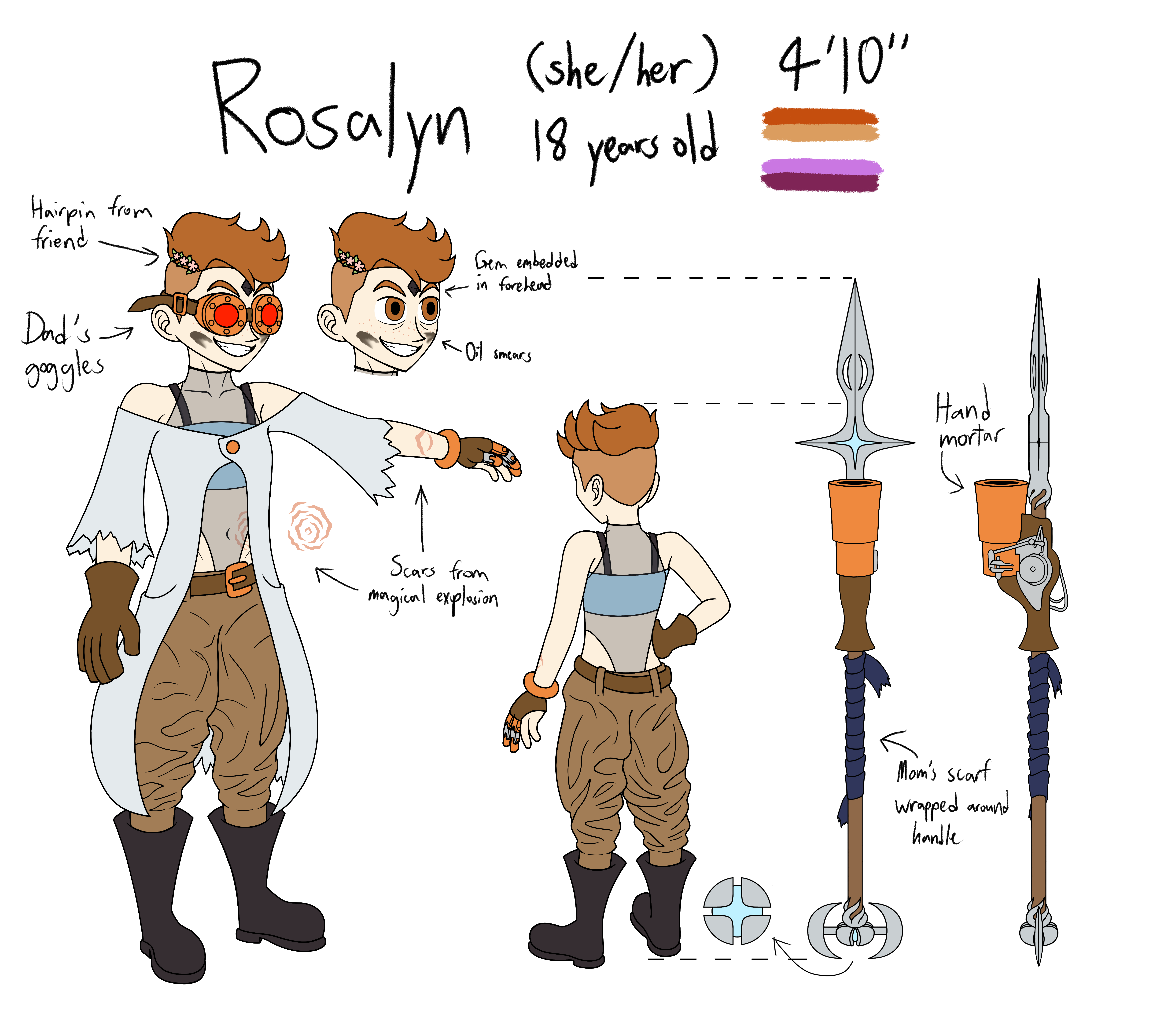
this event called artfight happens each year where people draw eachothers characters, so i made a ref sheet for rosalyn with some added details and information. i found out that you arent supposed to shade references, so i fixed that. i also changed the shape of her mouth and showed her eye color (dont know why i didnt realize that was important before). ive also taken the runes off the spear design (they're canonically still there but itd be a huge pain to redraw all that every time) and also attached a gun that my dm let her make to it. the reason she's 4'10 is because i want to be shorter in real life... whats a dnd character without a good amount of projection at the end of the day.....

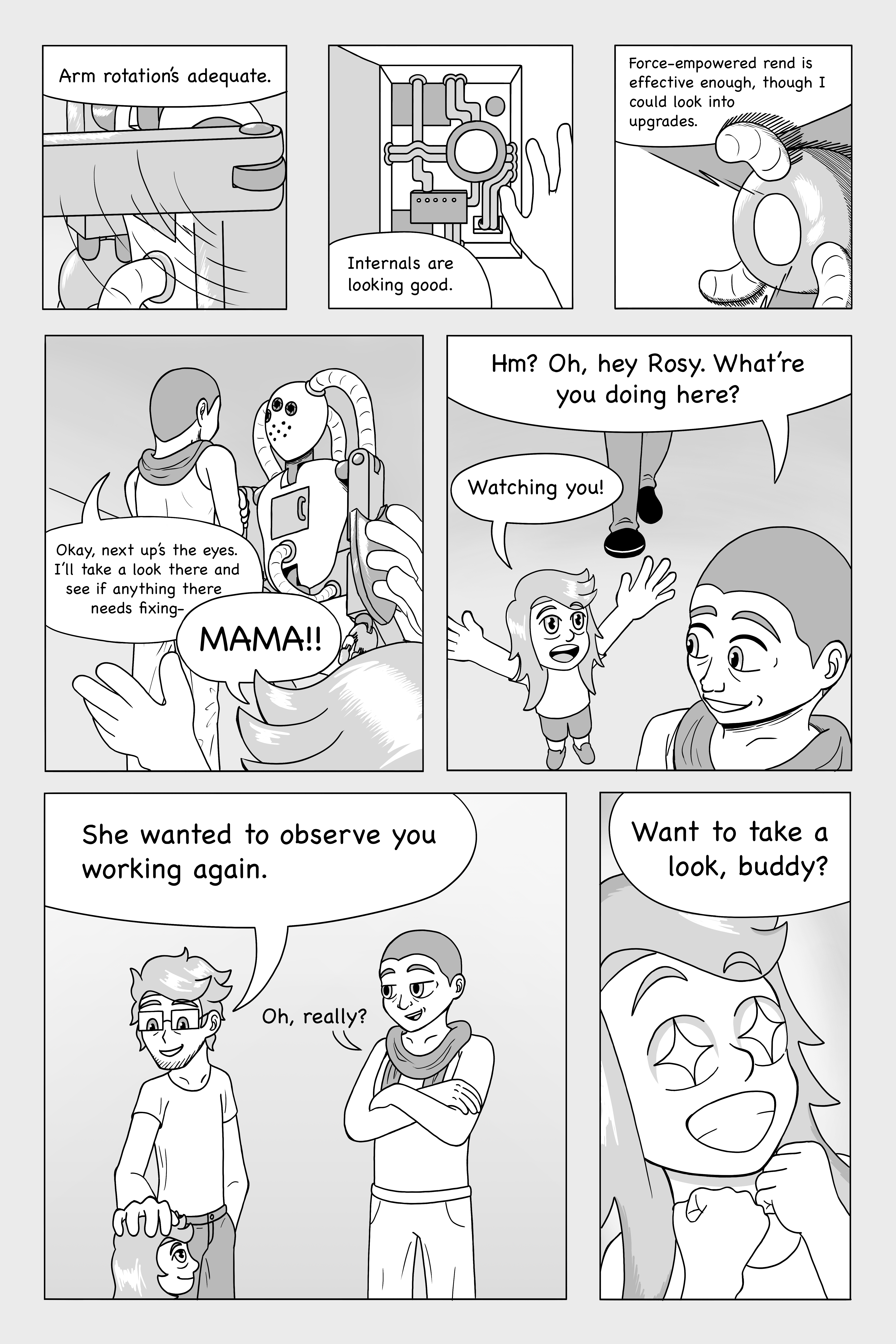


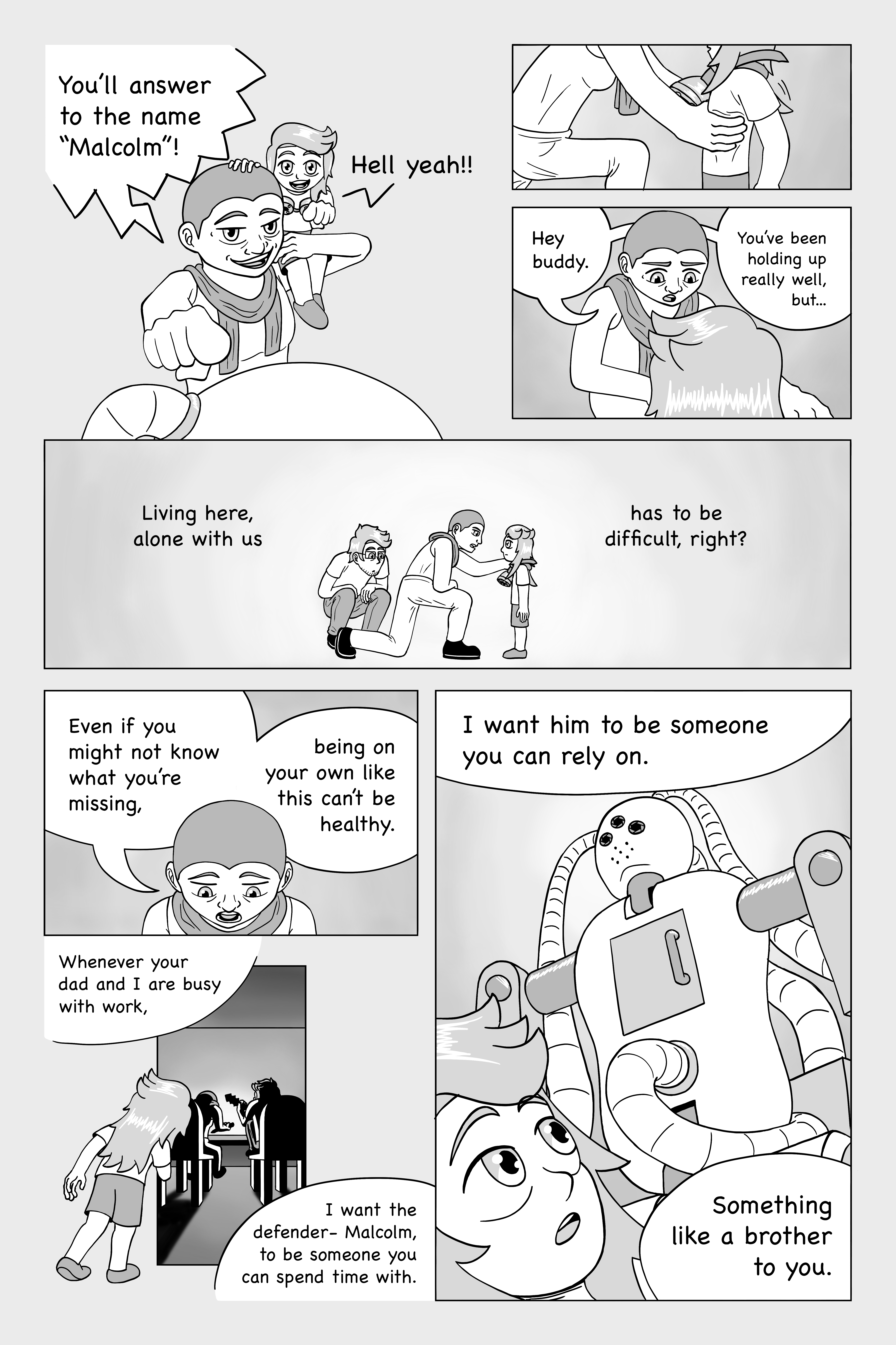

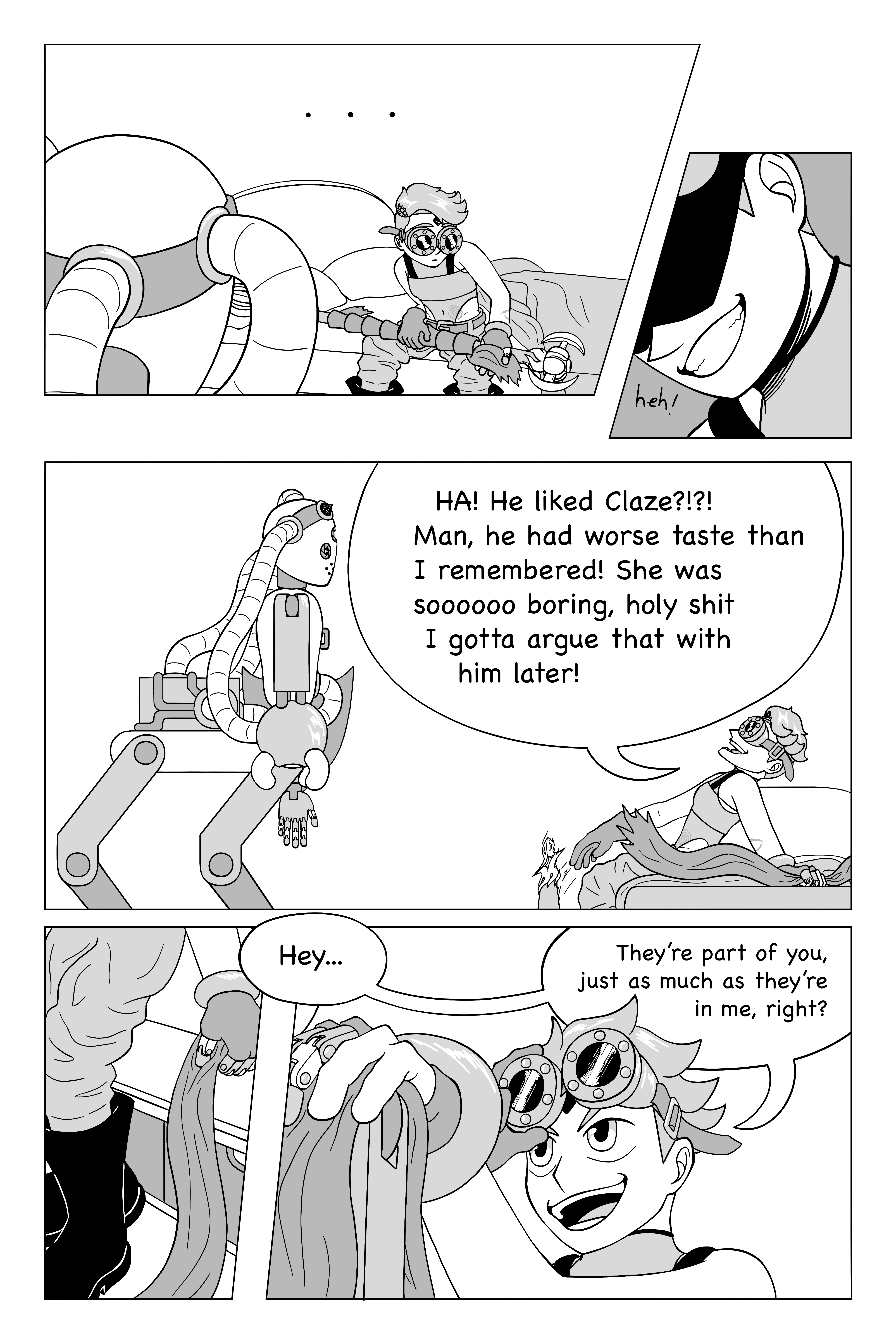
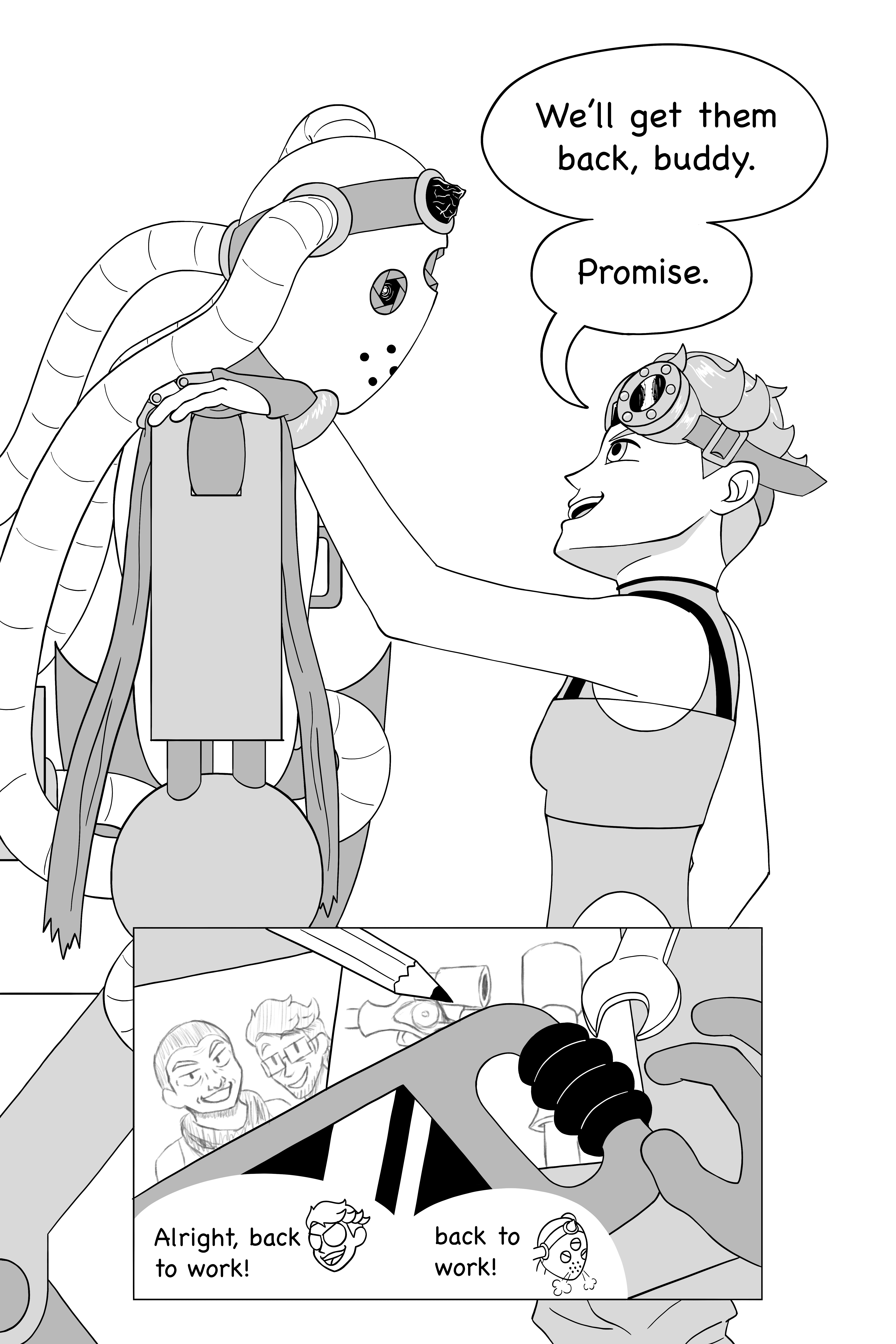
i wanted to make a comic about rosalyn's relationship with her parents and malcolm, and it ended up taking way too long. im glad i got it out, but looking back theres a lot of drawings i dont really like and writing is really not my strong suit... but there are still some individual bits i enjoy so im a bit conflicted on this one.
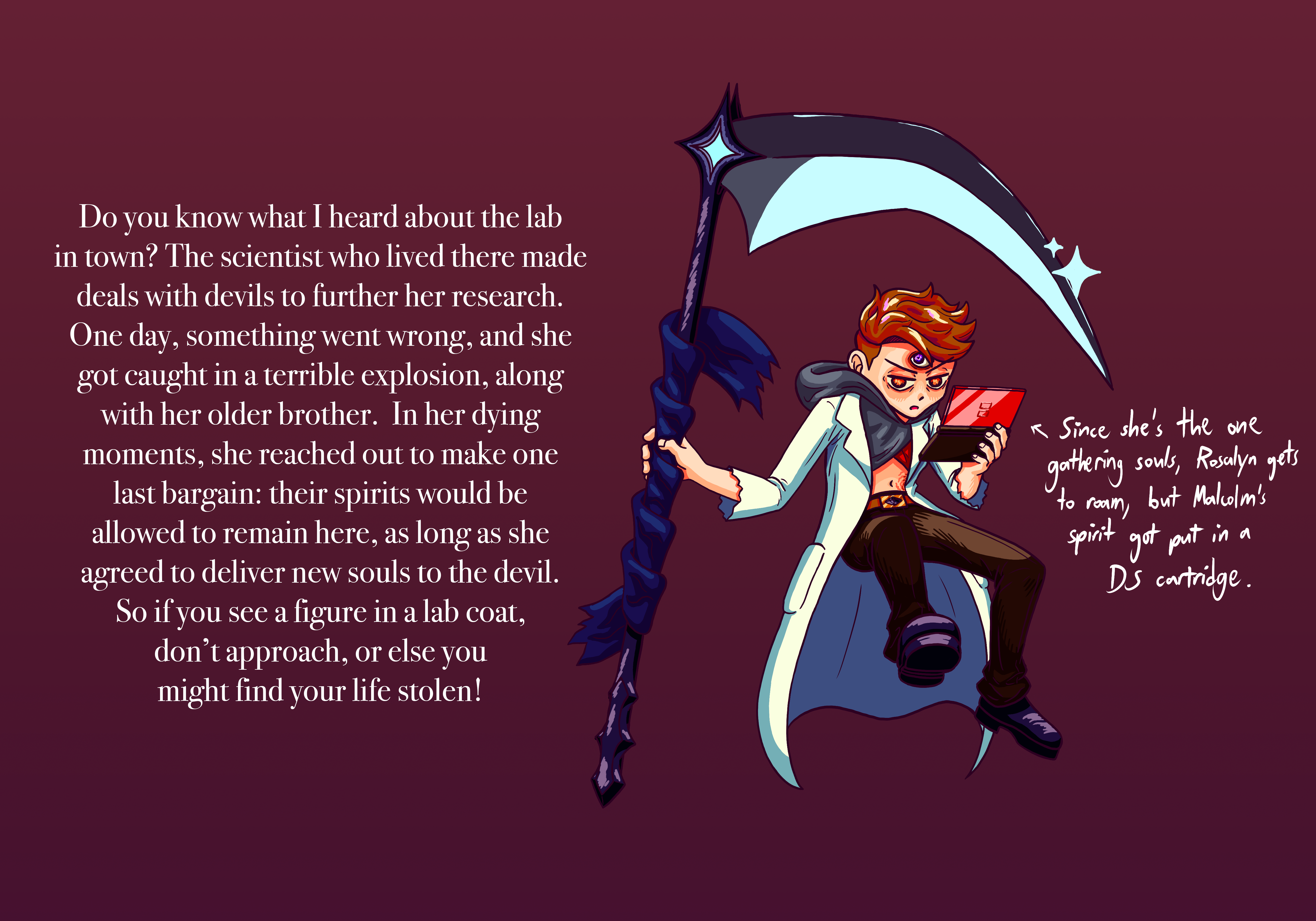
i got really into this manga called toilet-bound hanako-kun, and it ended up altering my art style somewhat. it was october, so i made this modern ghost/grim reaper version of rosalyn. her scythe combines aspects of her staff and spear, and instead of a gem on her forehead she has a full third eye (though the gem is still there on her belt buckle). for the backstory, i combined parts from her actual story in the campaign with faust

i felt like doing another alternate universe version so i did one where she became a bard instead of an artificer. the telesen is from electronicos fantasticos, a japanese project which uses things like crt displays or barcode scanners to make musical instruments, which i think is really cool. as a bard, she has no pretences of wisdom or calm that contributed to her blue clothing, so she wears pretty much entirely warm colors. her vest is also meant to be an opposite to her regular coat, it emphasizes the shoulders while the coat is shoulderless, it closes off the middle area while the coat exposes it, and the vest's coattails curl out while the bottom of her coat goes inward.
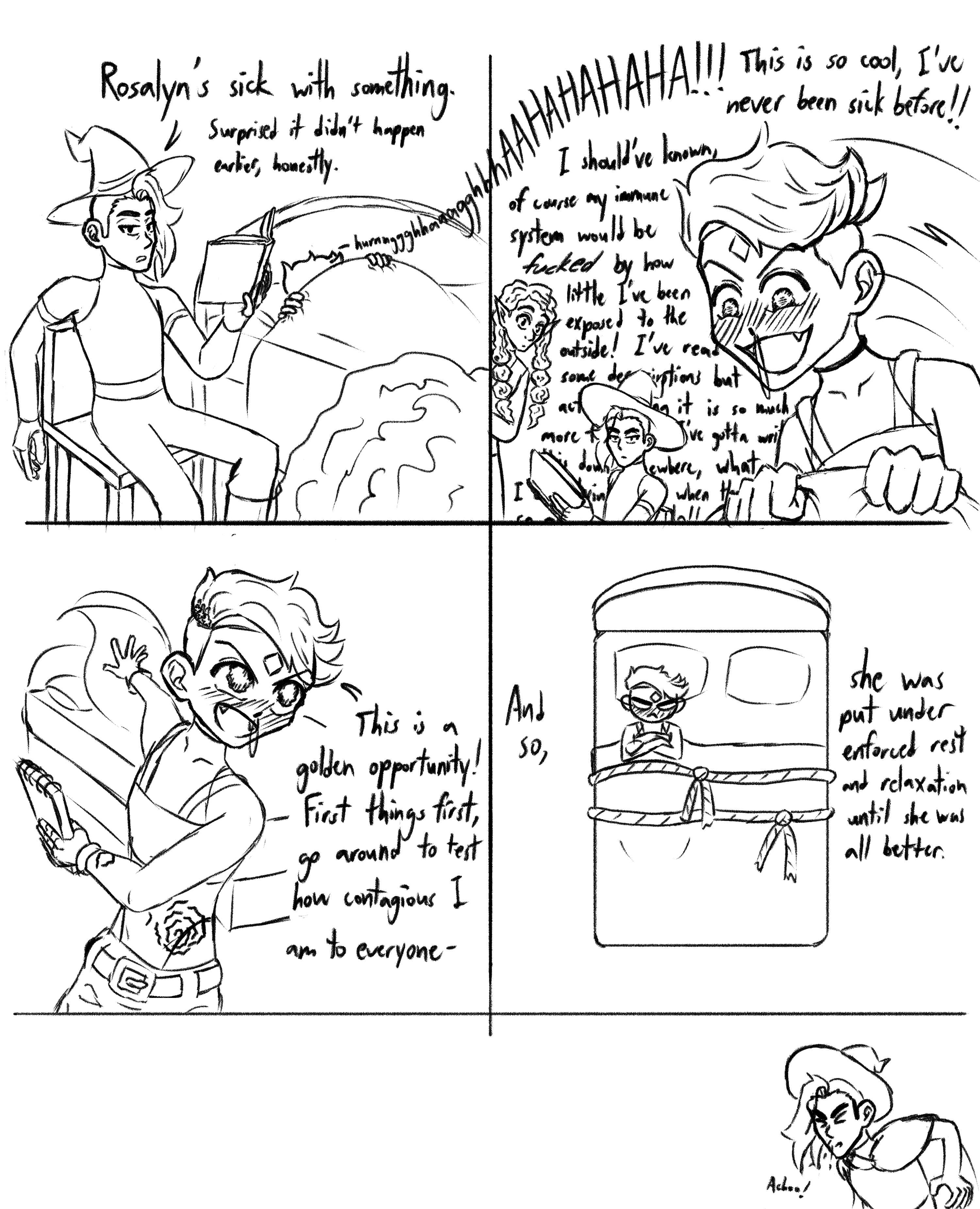
comic where rosalyn gets sick, with kuro and ace. i like imagining little scenarios like this and how theyd play out. im realizing as im writing this that her belt buckle is the wrong way. also im sick right now while writing so thats a fun coincidence.
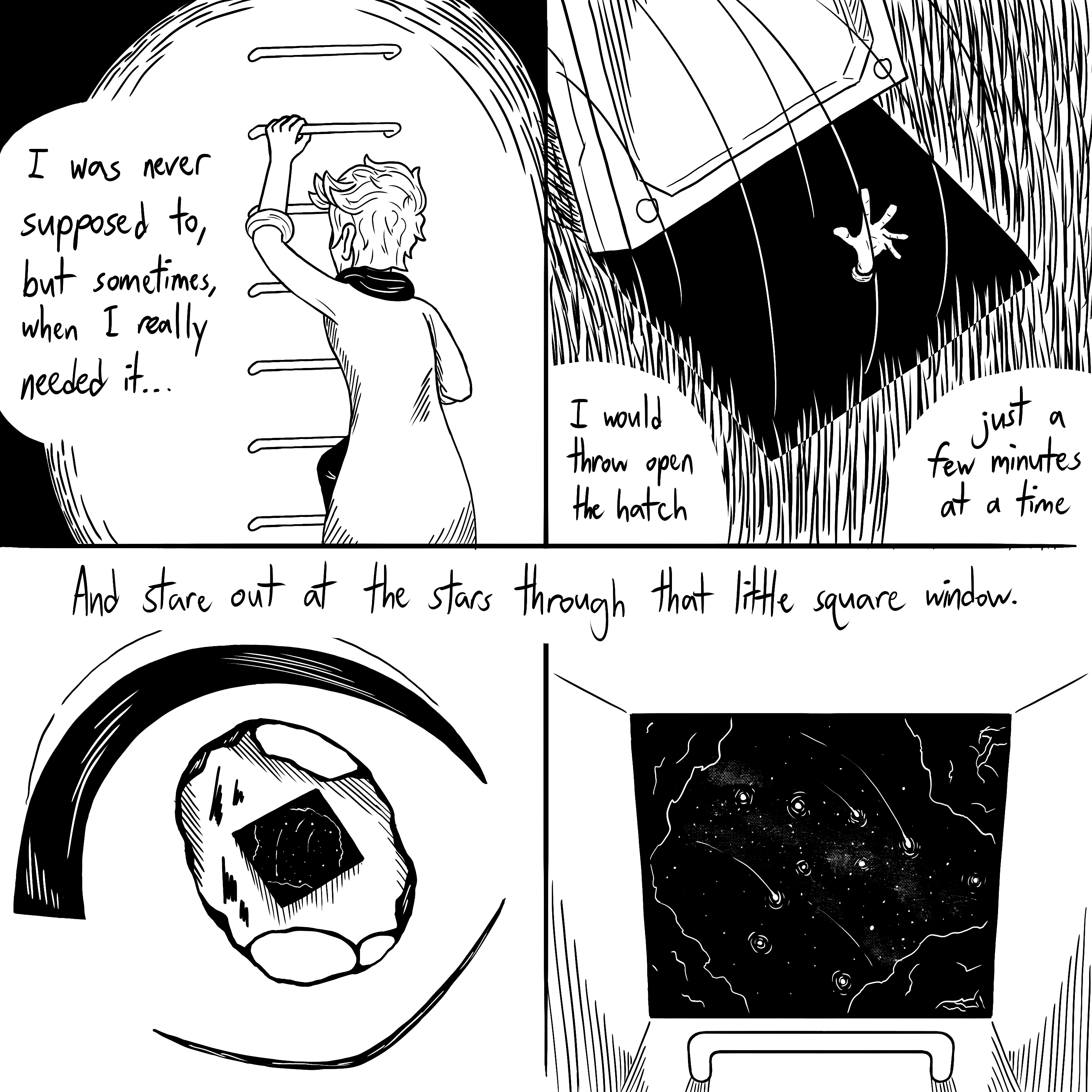
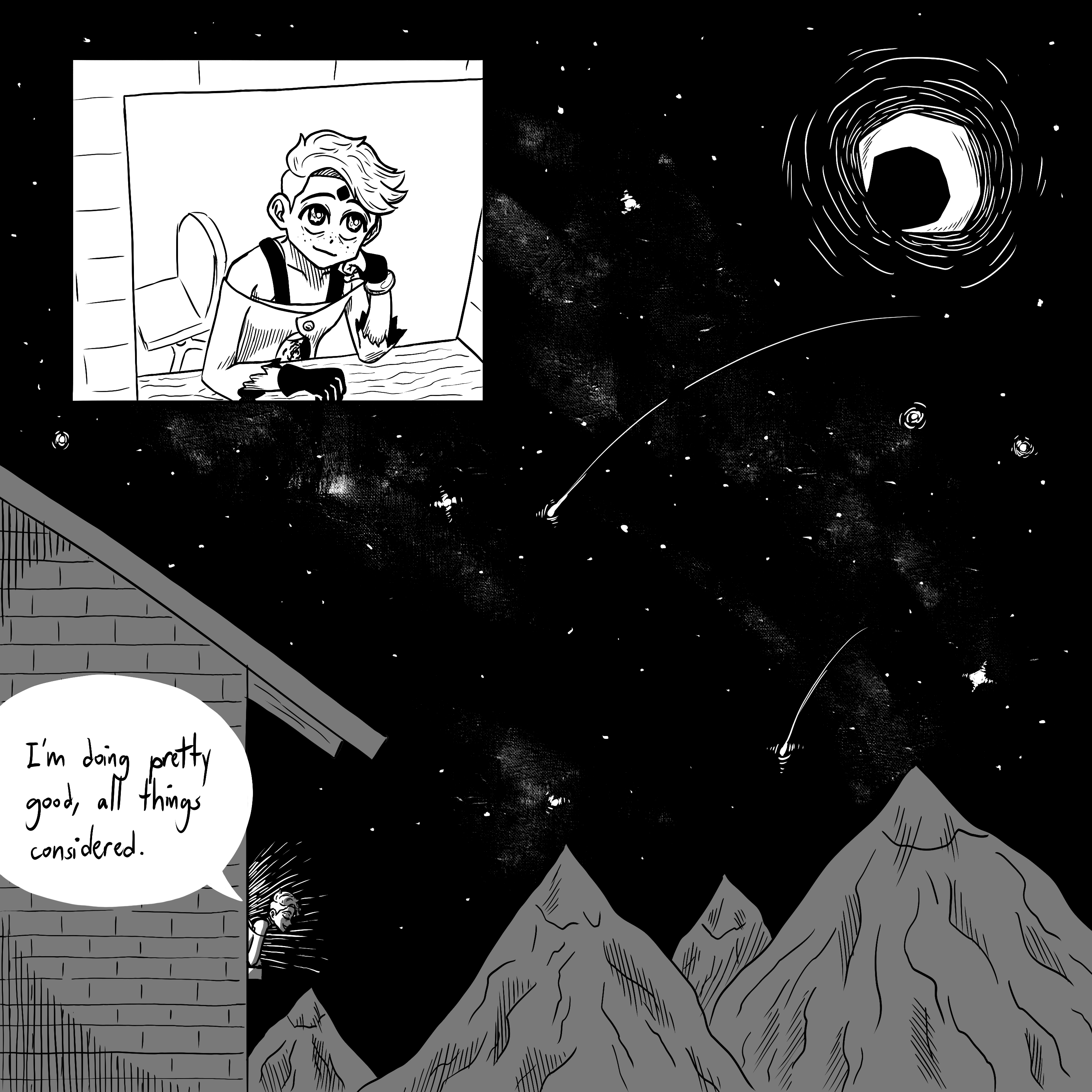
rosalyn spent most of her life underground unable to leave, so i wanted to make a comic where she reflects on how far shes come since then a bit. i thought it was fun drawing that old design i had for her again, even if it was only from the back.

hey, youve seen this one already! the authors of that manga i mentioned earlier do drawings of the characters eating pocky for pocky day, 11/11, so i felt like doing that too. so far this is the latest drawing ive done of her, and i like it......... except for the fact that i forgot shes left-handed. whoops.